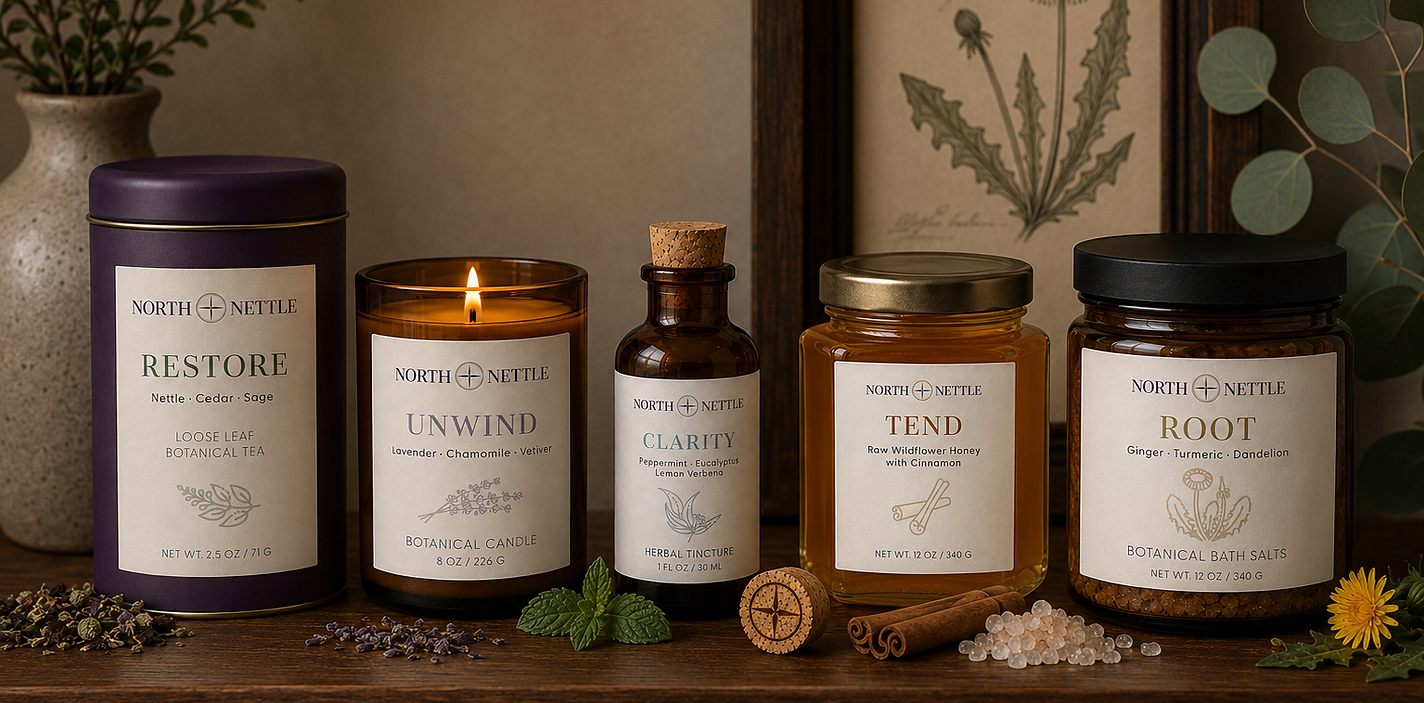
North + Nettle Brand Experience
A concept botanical house inspired by ritual, restoration, and understated luxury.
A Place to Slow Down
North + Nettle began as an exploration of what happens when a brand is designed around a feeling instead of a product. Rather than creating a traditional tea company, I set out to build a place where everyday rituals become opportunities to slow down, reconnect, and restore.
Every decision, from the visual identity to the packaging, was guided by the same question:
How should this place make people feel?



At the heart of North + Nettle is the idea that everyday rituals can become moments of restoration. Inspired by the landscapes of the North, the identity blends quiet luxury with a deep sense of place, creating a brand that feels both timeless and deeply personal.
The wordmark is a refined Didone typeface, chosen for its elegant proportions and editorial character. Its high contrast and graceful forms evoke the sophistication of heritage apothecaries while maintaining the restraint expected of a modern luxury brand.
I replaced the traditional ampersand with a custom compass symbol that serves as the + connecting both words representing the meeting of nature and ritual, place and practice.
The palette is anchored by a rich deep plum, complemented by antique gold, warm walnut, soft cream, and muted botanical tones. Together, these colors evoke the quiet beauty of northern landscapes while creating an atmosphere of warmth, craftsmanship, and understated elegance. Individual ritual collections introduce subtle accent colors, allowing each experience to feel distinct while remaining rooted in a cohesive master identity.
Find Your North
The compass is more than a symbol. It reflects the philosophy behind the brand.
Each collection features a compass with a different point highlighted, reinforcing the idea that there is no single direction toward well-being. Every ritual has its own north, and every season of life asks us to orient ourselves differently.
Whether restoring, unwinding, tending, rooting, or seeking clarity, North + Nettle encourages the belief that finding your way isn't about following one path. It's about recognizing the one you need today.


Packaging as an Experience
Every package was designed to feel intentional from the moment it's picked up to the moment it's opened.
Soft-touch finishes, warm cream labels, muted botanical illustrations, and restrained typography create a consistent visual system across every product. Small details, like a compass burned into a natural cork or uncoated paper labels, reinforce the handcrafted nature of the brand.
The goal wasn't simply beautiful packaging. It was to make opening each product feel like part of the ritual itself.
Beyond the Shelf
North + Nettle was imagined as more than a collection of products. It became a complete retail experience. The brand extends into gift packaging, tissue paper, shopping bags, merchandise, environment and in-store moments, creating a world that feels cohesive at every touchpoint.
Every interaction was designed to support the same feeling:
Slow down. Stay awhile. Restore.


Bringing the Brand to Life
To explore the brand beyond static visuals, I developed a motion concept that extends the North + Nettle beyond the printed page.
Using AI-assisted image generation and motion tools, I art directed each scene to create a cohesive atmosphere that reflects the brand's identity, from opening a tea tin and pouring a warm cup to quiet moments overlooking Lake Champlain.